
Inflation Analogy

From the always interesting Torsten Slok at Apollo. This is a too easy game to play, and proves nothing. Lots of graphs like this go haywire the day you make them. Still it raises an interesting analogy and possibility. Add to the “scenarios to consider” pile.
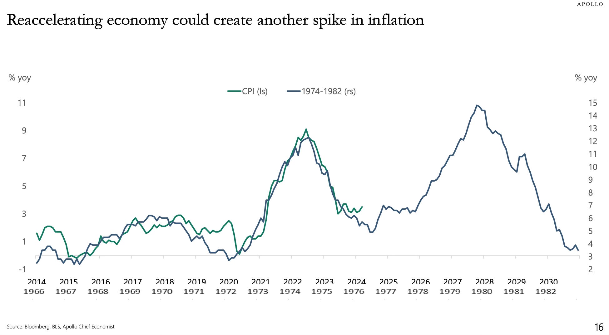
The chart from Torsten Slok (Apollo) has been manipulated -- the data from the two time series (1966-82, and 2014-24) have different vertical axis and horizontal axis scales -- to give the impression that there is a correlation between the time series. Because we are only presented with the chart and not with Slok's narrative, we cannot say with any degree of confidence that the manipulation of the charted data was done to mislead the readers of Slok's blog. Regardless, John, you should inform your readers that the chart is manipulated to create the impression that history repeats.
The astute reader can recreate Slok's chart by accessing the CPIAUCSL data available at https://fred.stlouisfed.org/series/CPIAUCSL and then calculating the lagged 12-month change in CPI for each of the two series, 1966-1982 and 2014-2024, and plotting the data so obtained on graph. The default data time interval is one month. Therefore, the time scale on the horizontal axis should be the number of months from the from December 1965 (in the case of the 1966-82 time series) and from December 2013 (in the case of the 2014-24 times series).
The 1966-1982 lagged 12-month change in CPI data should be plotted on the primary vertical axis; and, the 2014-2024 data lagged 12-month change in CPI data should be plotted on the secondary vertical axis. Then change the primary vertical axis maximum to 0.12, while keeping the primary vertical axis minimum at the default value; and, set the secondary vertical axis maximum to 0.09 and the secondary vertical axis minimum to 0.025. Setting the horizontal axis maximum to 202 and the minimum to 0, uses the full extent of the chart created by the software application (MS Excel, for example).
John's cautionary statement to readers of his blog is likely to be too true in light of Slok's manipulations of his graphed data!
One difference between the 1970s and 2020s is tight supplies of labor, oil, and many other factors of production. If these constraints could be relieved, slightly looser money might allow the real economy to expand without increasing inflation. When the Fed is given credit for a soft landing, I usually respond that the plane hasn't touched down yet. But relieving supply constraints and keeping inflation under control would be a truly soft landing.